Meetup
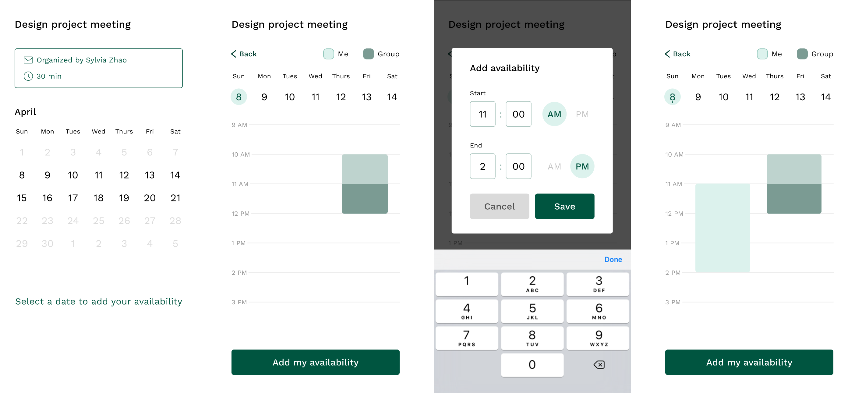
Coordinating group events
Does anyone enjoy coordinating when a group of 12 people can meet for a rehearsal or party? Meetup offers a responsive design for students providing availability to a group event.
Role
UX designer
Timeline
1.5 months
How do people feel?
19 survey responses - the importance of seeing everybody's availability
Given that students consistently need to schedule group meetings for clubs and projects without the use of organized systems (like Microsoft Outlook), I surveyed 19 university students to understand their diverse scheduling processes and methods. The responses showed a general trend that people consider scheduling group meetings to be a difficult process.
63% of people find group scheduling difficult or very difficult
Assessed general emotions from Very Easy to Very Difficult on a 5 point Likert scale
58% of invitees prioritize seeing group availability
Invitees care about seeing when other people are available as they fill out their own availability
74% of people prefer to use When2meet
The majority of people chose When2meet as their preferred tool, matching the preference to collect availability first
67% of organizers collect availability first
Organizers prefer asking for availability first over proposing a set of times to the group and having people choose
5 interviews - frustrations with mobile usability
I spoke with students who had experience managing teams and clubs. Synthesis of comments from the interviews was consistent with survey results with people emphasizing the need to see all availability in one place and the ease of using When2meet in various workflows for scheduling meetings. The interviews referenced When2meet's pain points of poor mobile usability and tedious process to input availability.
Understanding user pain points
When2meet: a scheduling web app not optimized for mobile
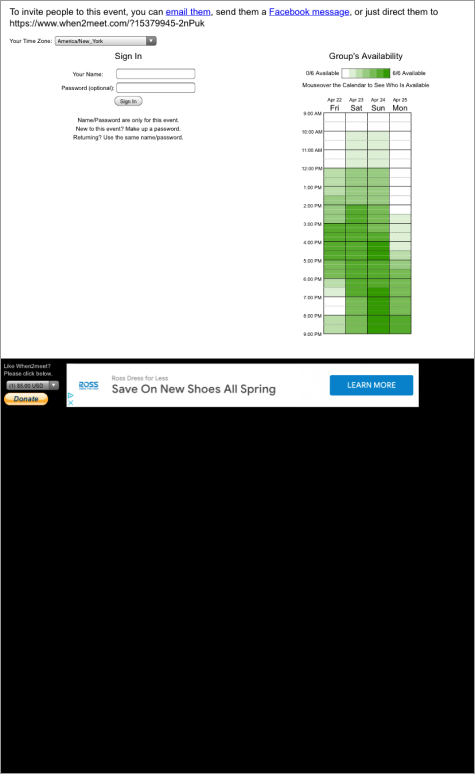
Based on the survey showing the popular use of When2meet, I analyzed the pain points brought up in interviews. Although When2meet offers a convenient solution for meeting scheduling, it suffers from poor usability, lacking a mobile responsive site. Operating as a web app, When2meet has one person send out a link from the platform to the rest of their team members to gather their availability during a specified period of time.
Create event
Organizer creates an event on the When2meet site
Send invite
Organizer sends invite link to people
Add availability
Invitees fill out their availability through the invite link
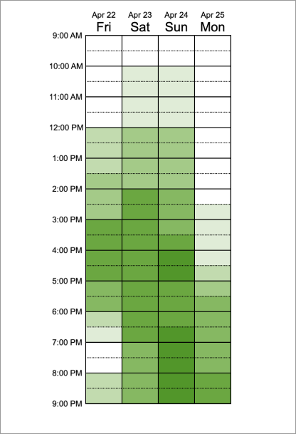
Dragging interaction to add time translates poorly to mobile
To add availability, users have to click and drag in the grid. This becomes difficult on mobile at a small size, creating usability and accessibility issues.
Key research insights & hypothesis
Improving mobile usability should be the main goal
Mobile usability pain points were emphasized during interviews as a major frustration with apps like When2meet. Both invitees and organizers also indicated that having a visualization of the group's availability is key to an efficient scheduling experience.
Direct & precise interactions
Simplifying interactions to improve mobile usability
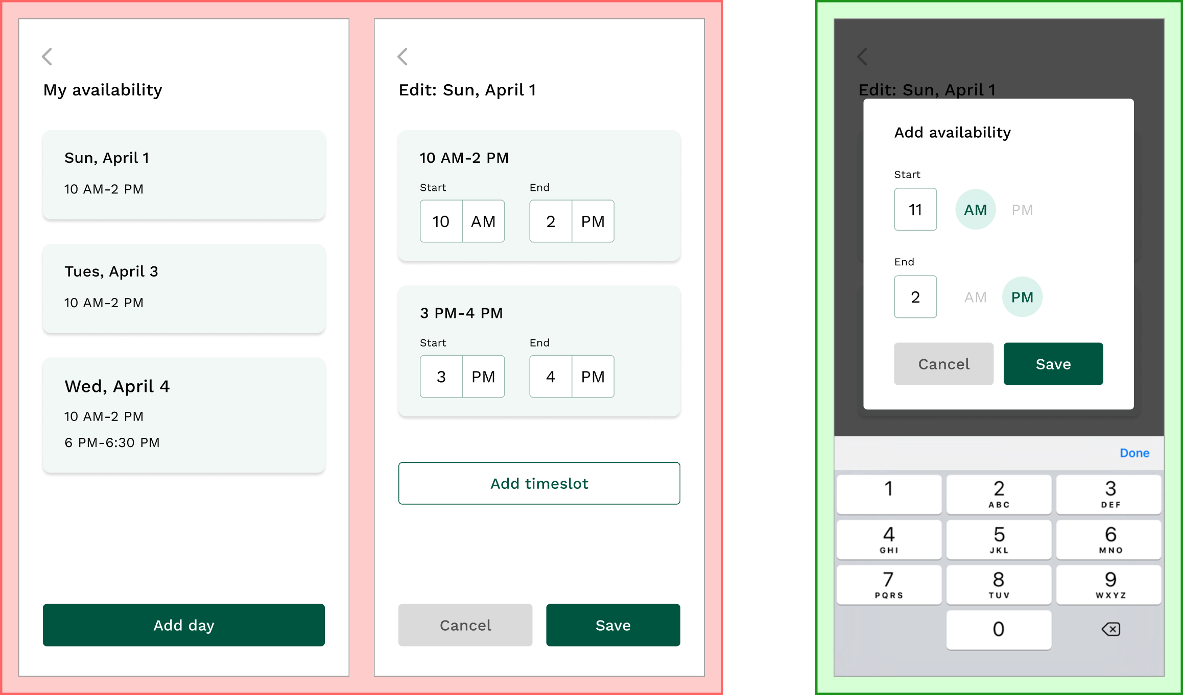
The first iteration focused on having the user add their availability for a given day by clicking a card in the “My availability” section and adding timeslots.
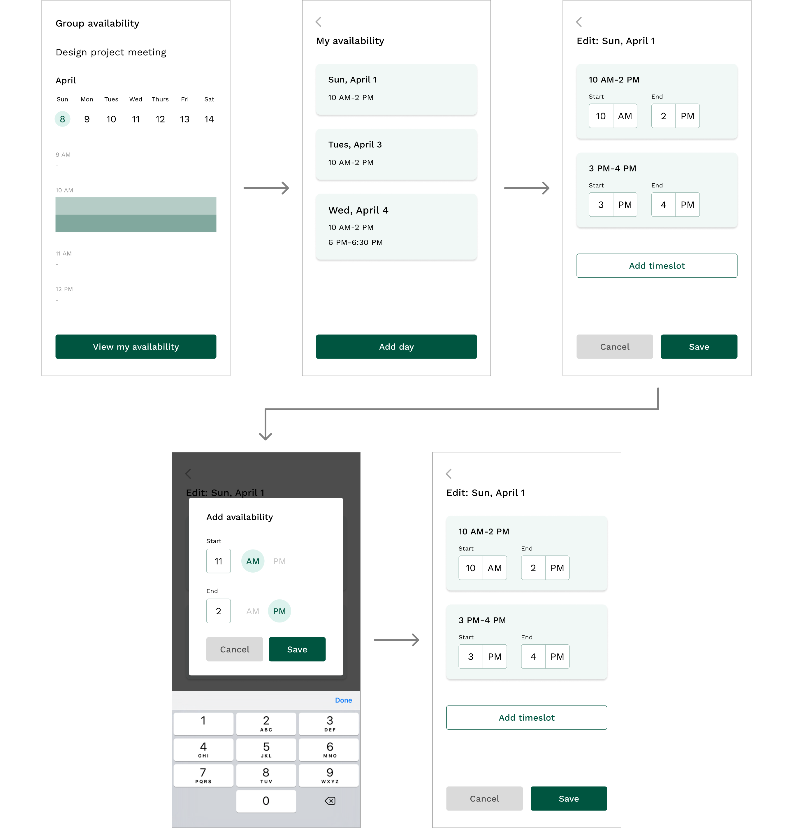
Negative user feedback on simplification, but positive for precision
After the initial wireframes and visual design, I gathered feedback from people who had participated in initial user research.
Too many steps
Users didn't feel a need for so many separate screens for editing, viewing, & adding availability
Clear tapping interaction
Users did enjoy the direct interactions for inputting times through typing instead of dragging like When2meet
Improving the flow & visualizations
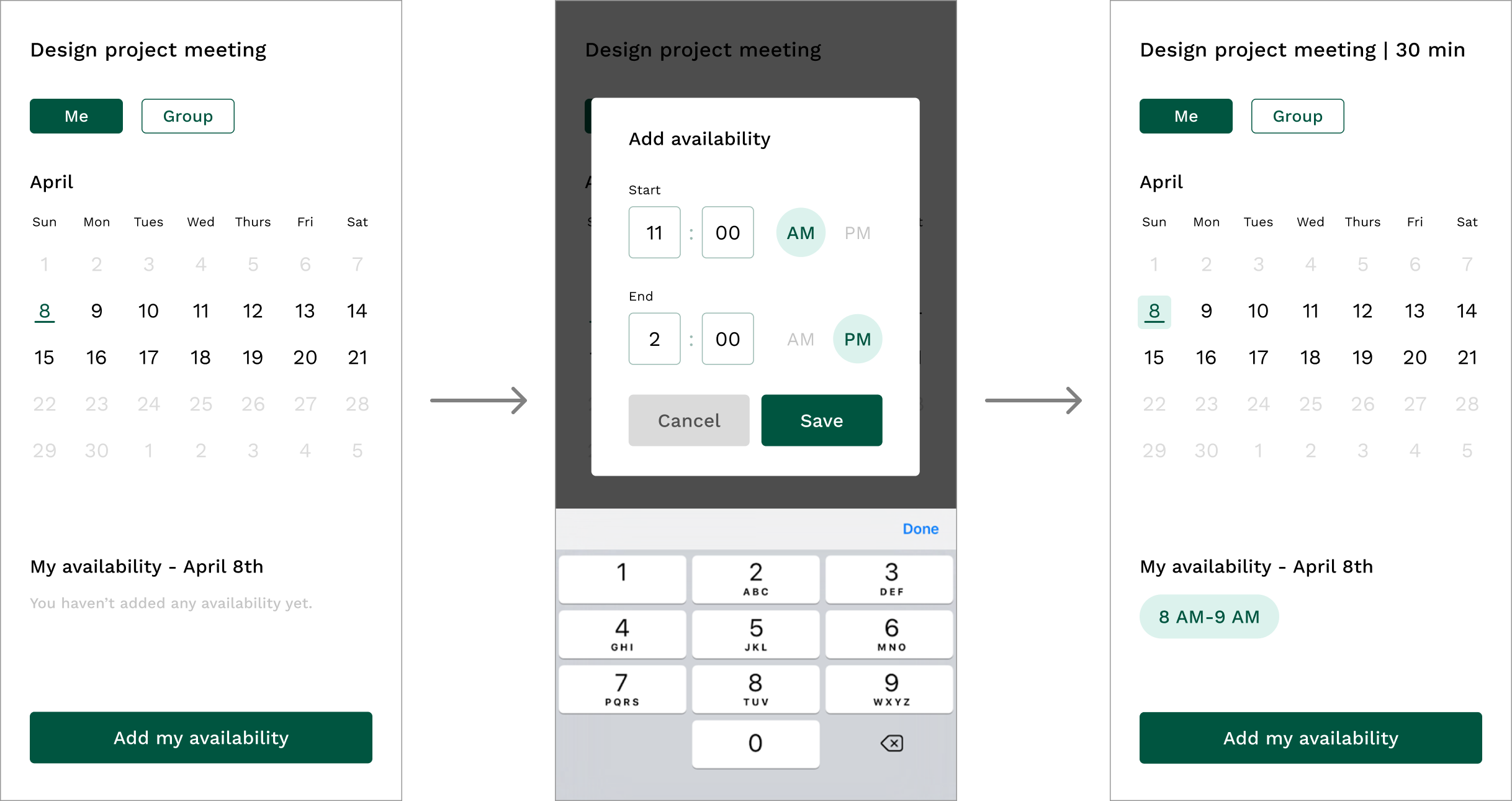
Reduced steps & introduced calendar view for better visualization
Based on the comments from the first round of user testing, I reorganized the user flow to begin with the user adding availability from a calendar view.

User testing round 2: the calendar needs to be more directly visual
With the user flow refined, feedback focused more on the visual design, specifically how availability was expressed with too much text and not enough quick visuals to summarize information.
Needs a side-by-side view
Users expressed a need for visual comparison between individual & group availability
Missing a timeslot visualization
The calendar lacked visualization of timeslots on individual days
Refining the visual design
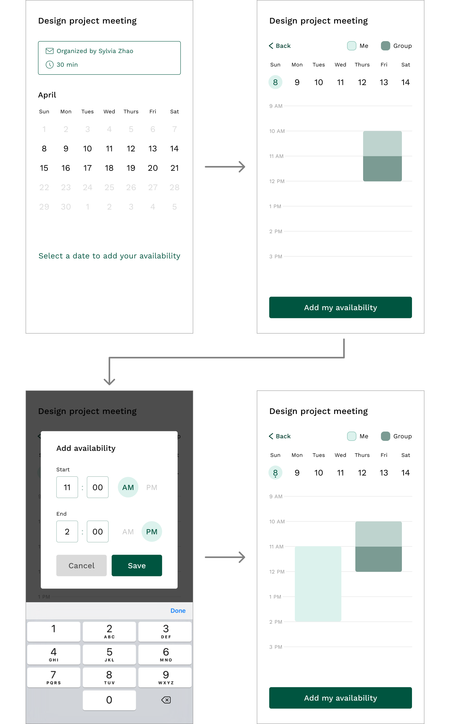
The final design preserves the precise interactions from initial designs & adds visual summaries of data
To address user feedback, the final solution introduces a secondary grid-view calendar. Users can see a summary view of days with availability in the first screen and then can view each day's timeslots in the next screen.
Final reflections & impact
While the final solution addresses the main pain point of mobile usability, further exploration could be done on how the platform would appear from the organizer side. Since this project only focused on the invitee side, research on the other perspective could be an interesting way to complete an understanding of the problem. This current solution still explores the general question of how people organize in groups.