CookBooked
What's up with online recipes?
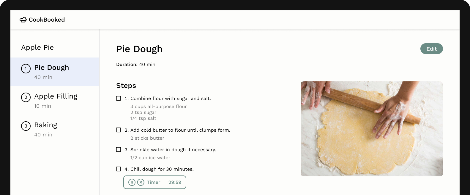
Picture the typical online recipe, full of long passages and distracting ads. CookBooked is an interactive web app designed to improve recipe organization and execution.
Role
UX designer & developer
Team
Jasmine Cao & Leah Levin (research, design, & dev)
Timeline
3 months
Disruptive experiences
We realized that online recipes aren't optimized for how people actually cook. Several pain points with formatting and structure create a rocky user experience. Our insights included:
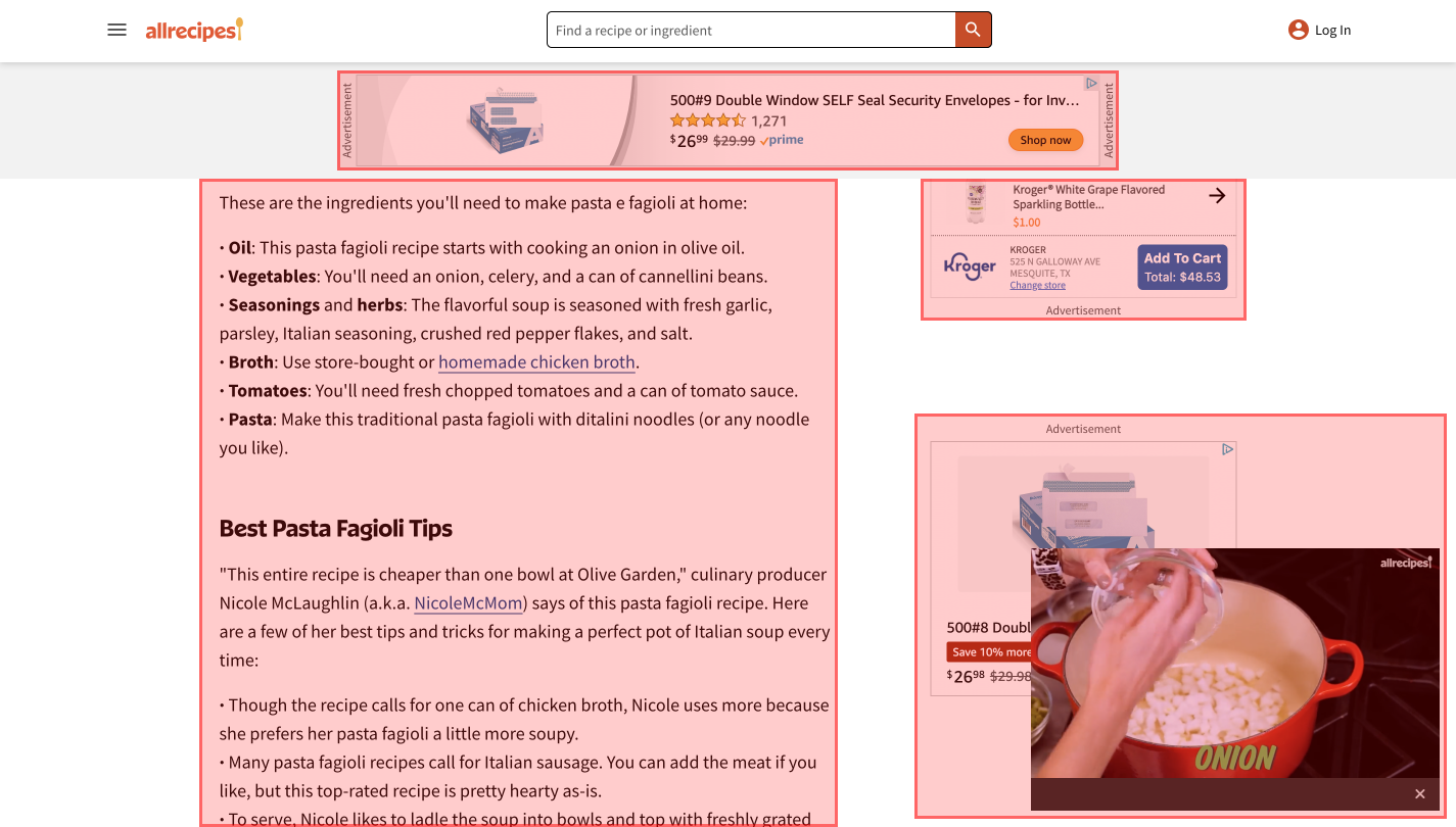
Too much scrolling back & forth
Current recipes force users to scroll back and forth between steps and ingredients
Ads slow down performance
Pages are covered in ads that distract the user and also slow sites down
Long text passages
Recipes are mostly presented as long text passages or lists not optimized for readability
Understanding our users
We conducted 4 interviews with potential users to better understand pain points and potential opportunities for designs.
Bending the purposes of other tools
People have co-opted project management tools like Notion and Obsidian or editors like Google Docs to hold their original recipes or links to online recipes. This means a lack of features specialized for cooking.

Scrambling for scattered information
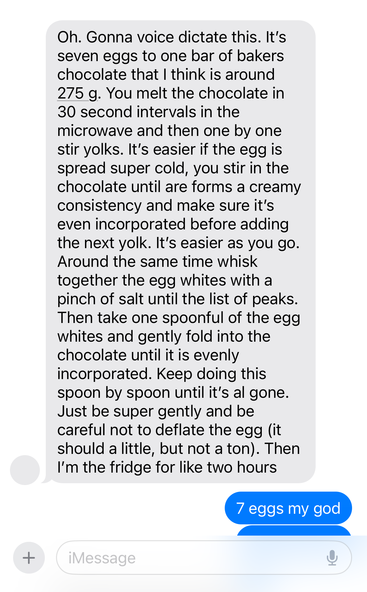
Some people also mentioned having recipes in the form of photos and text messages from friends scattered throughout their phones. People described feeling disorganized when they have to track down specific information.
Our driving question
Our research connected back to the analysis of existing online recipes: lots of purely text-based recipes, no focus on the advantage of digital interaction, and feelings of disorganization. Based on our interview insights, we decided to focus on how a central tool could have specialized features for people to organize their recipes and cook efficiently.
Solution
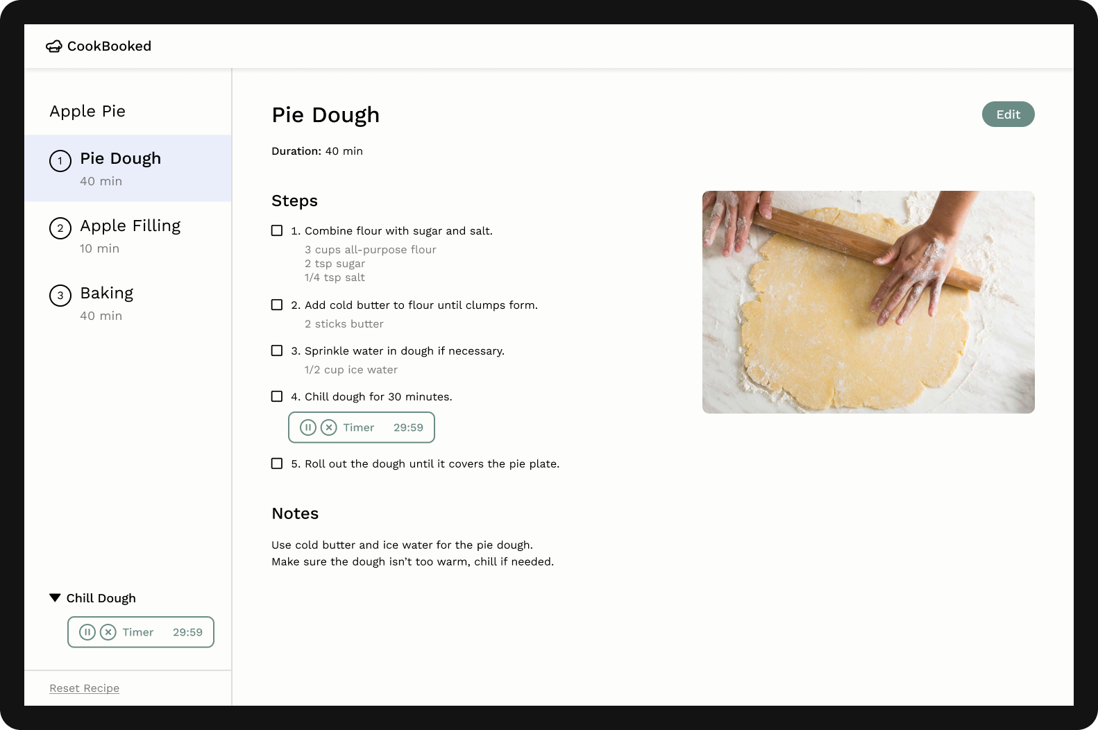
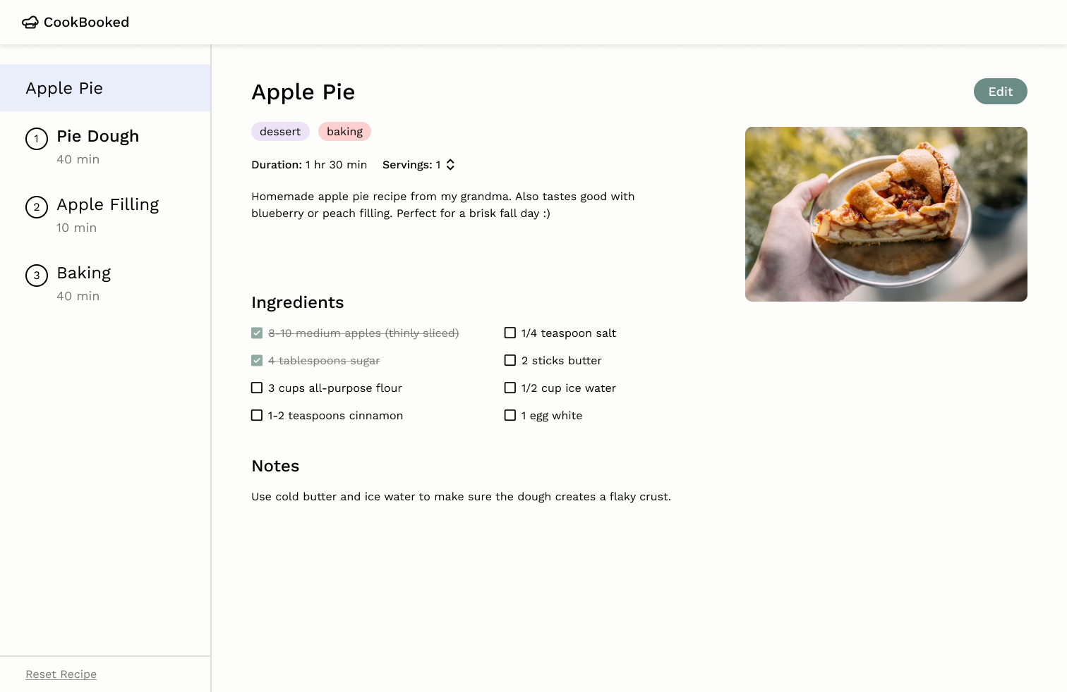
Modular recipe sections with interactive organization features
The final design focused on how users can execute a recipe when cooking. The team iterated through paper and digital prototypes. Some prototypes were then implemented in React for user testing in later stages as the app was built iteratively.
Choosing a direction for layout
Users preferred modular sections over a traditional layout
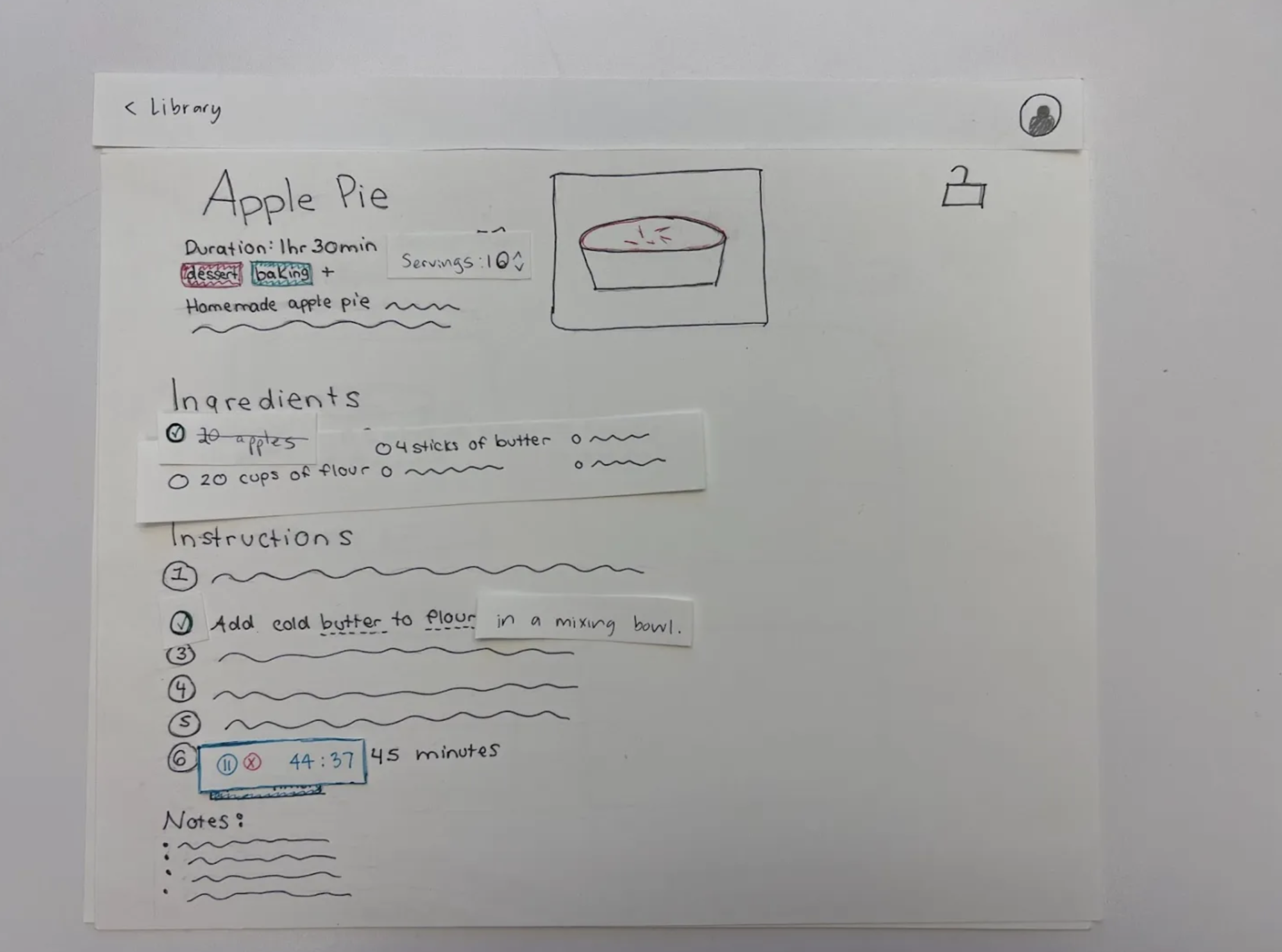
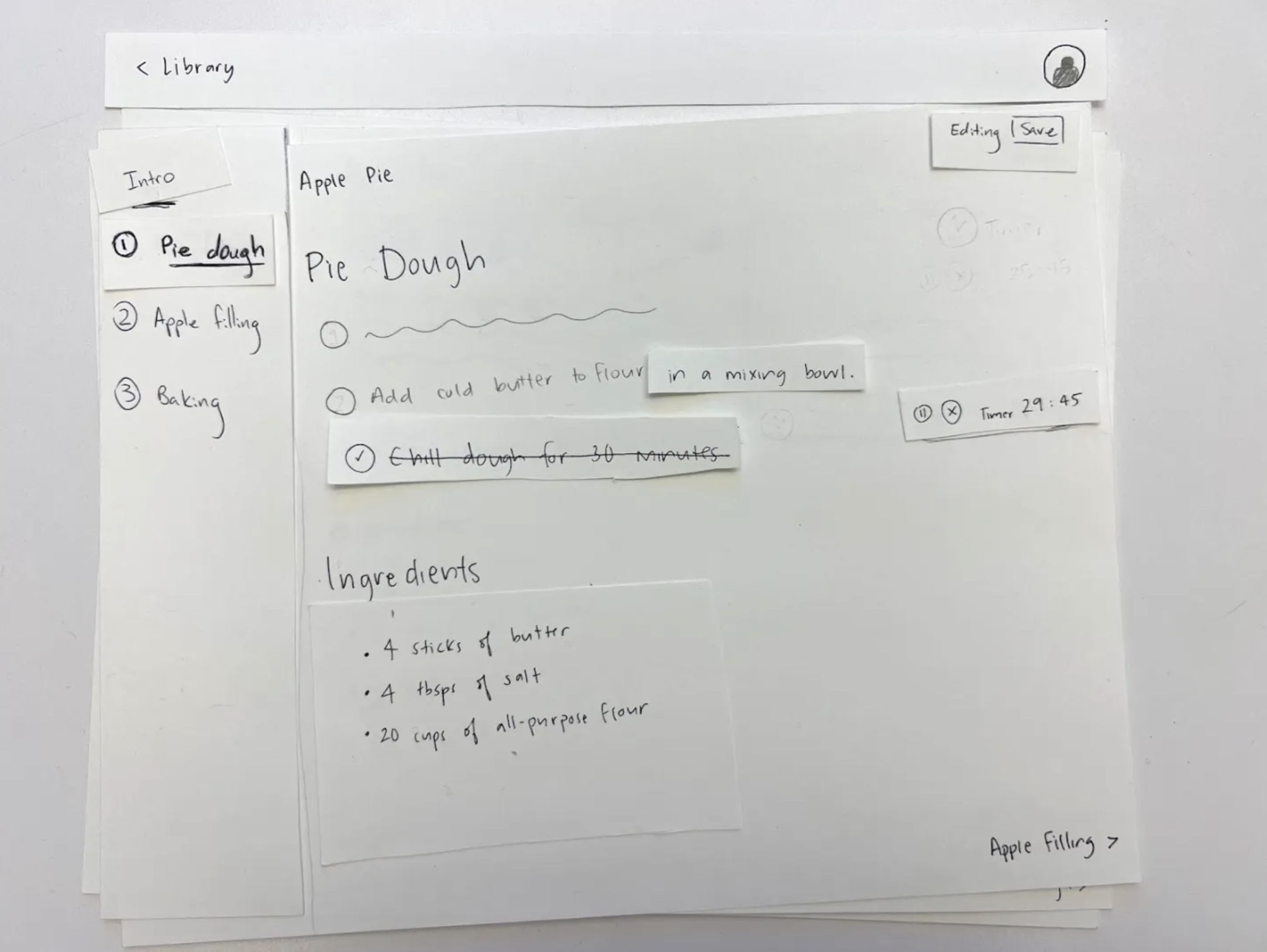
We developed two low-fidelity paper prototypes to experiment with the elements of a recipe interface. The first prototype uses a standard one page layout, while the second prototype splits a recipe into subsections for a more modular approach.
Prototyping for usability testing
To prep for testing, we prototyped the interactions for checkboxes, the sidebar, timers, and inline ingredient quantity display.
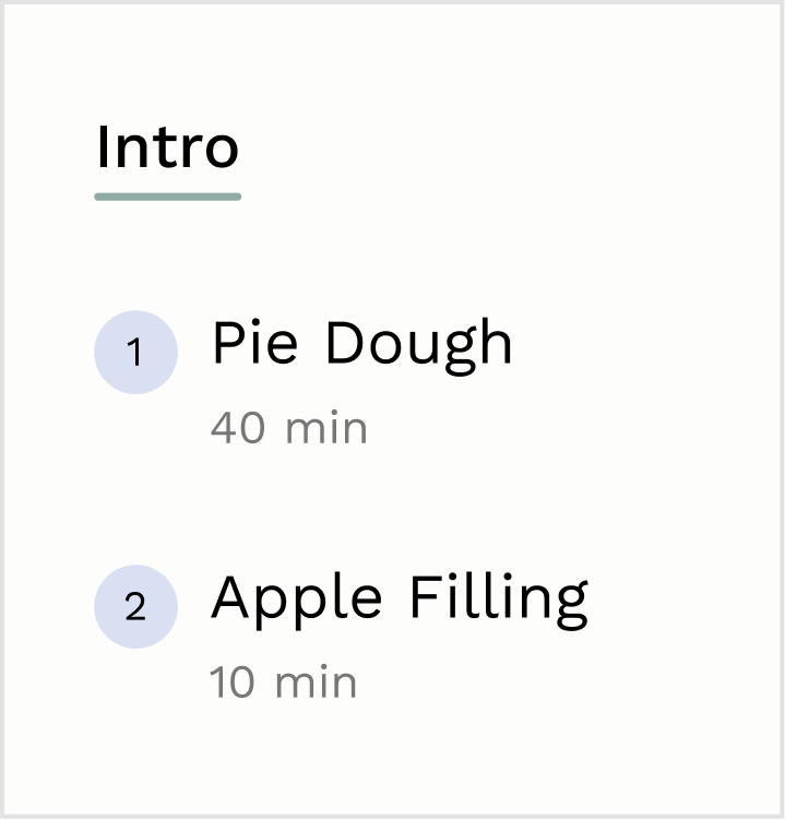
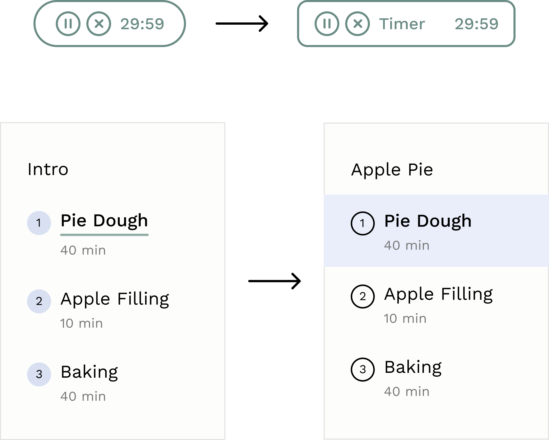
Sidebar with recipe sections
Allows users to split their recipes into sections for easy navigation and separation of tasks
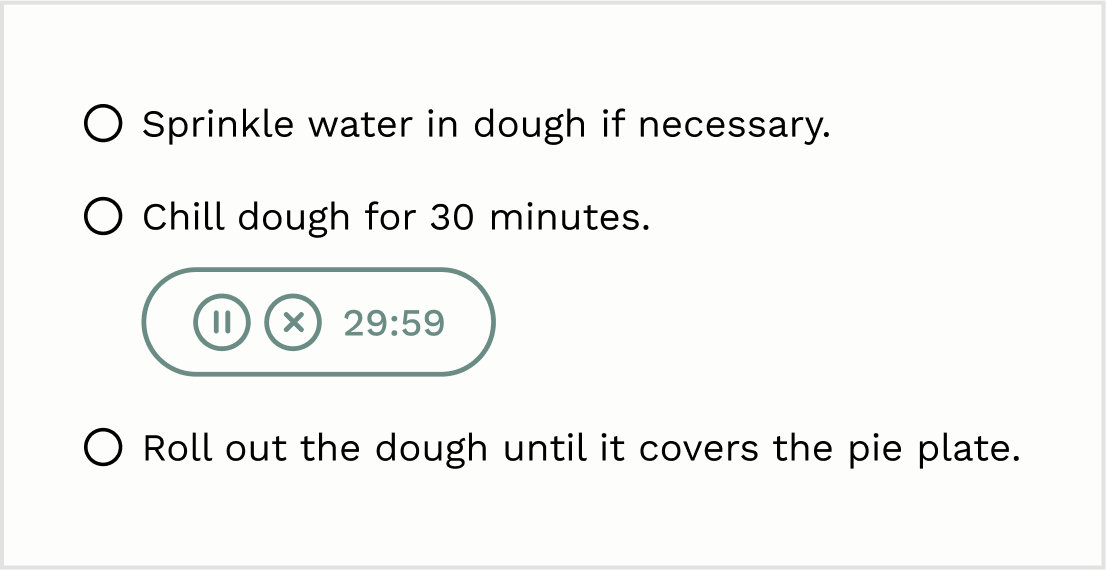
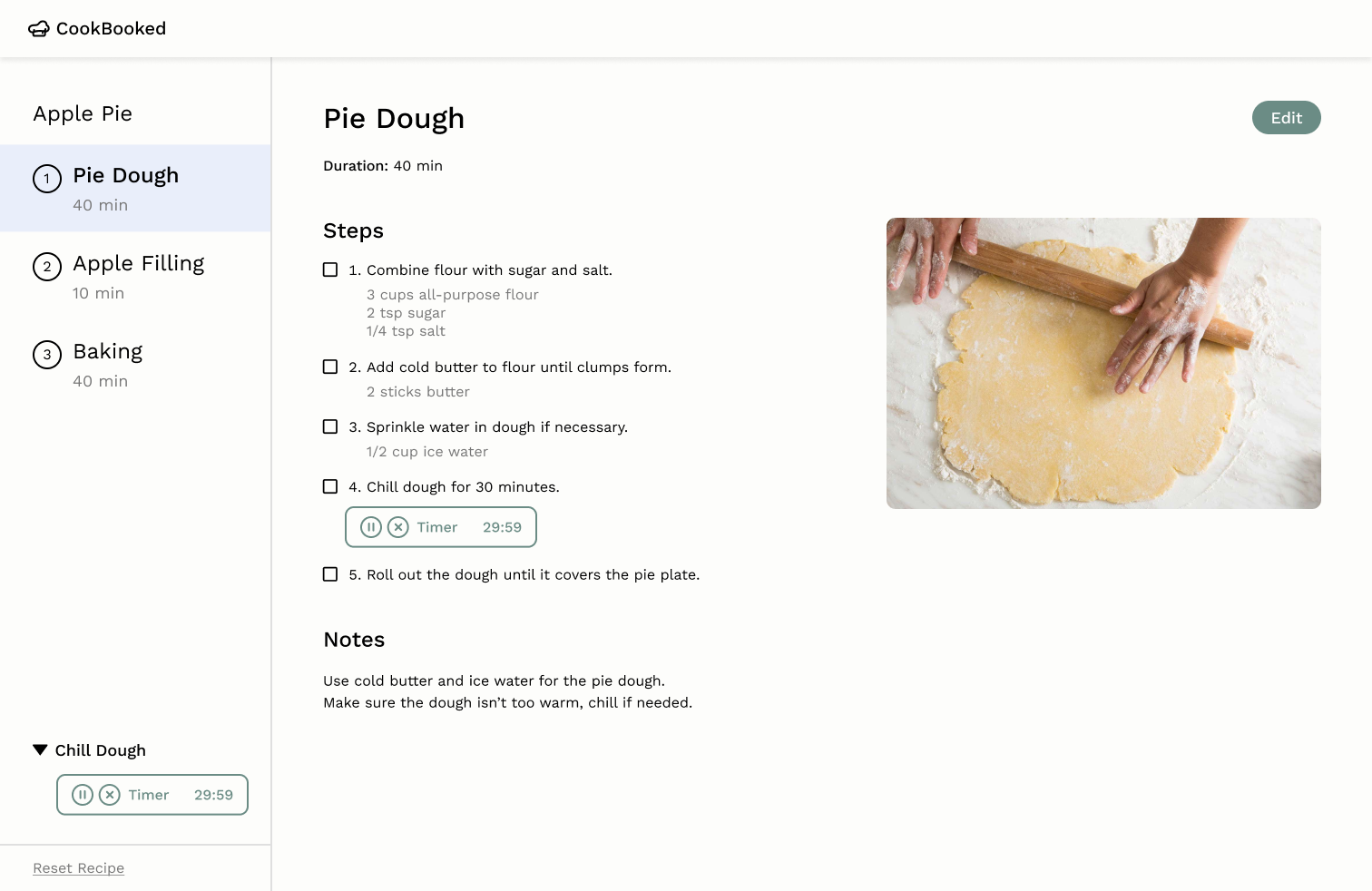
Embedded timers in steps
Fluid access to timers embedded in steps without leaving the recipe
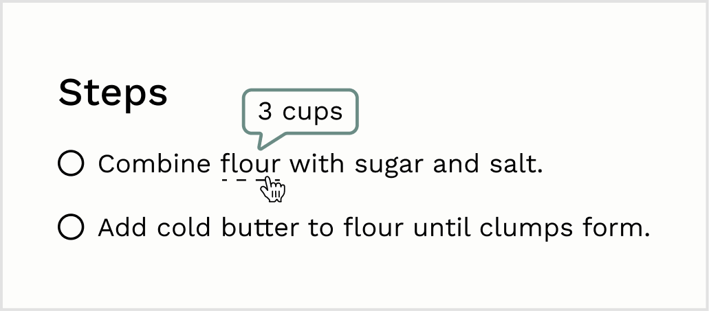
Quantities on hover
Convenient inline display of quantities when hovering over an ingredient in a step
Clear & cohesive UI choices
7 interviews for usability & visual design feedback
Using the hi-fi prototype, we collected feedback from 7 users and revised our initial screens. Revisions centered around the sidebar and timer designs.
Testing the layout
Did we really solve the readability issues?
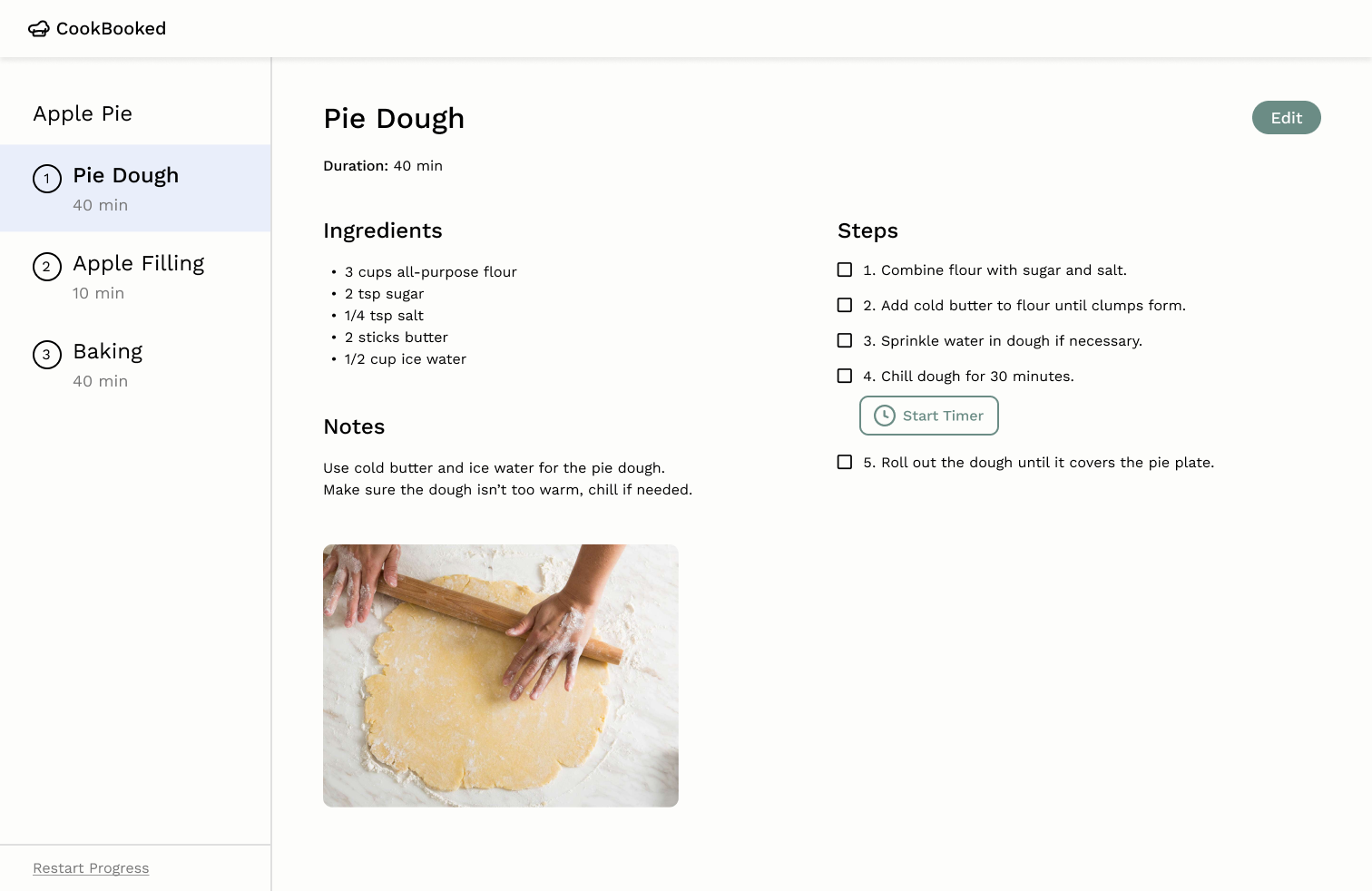
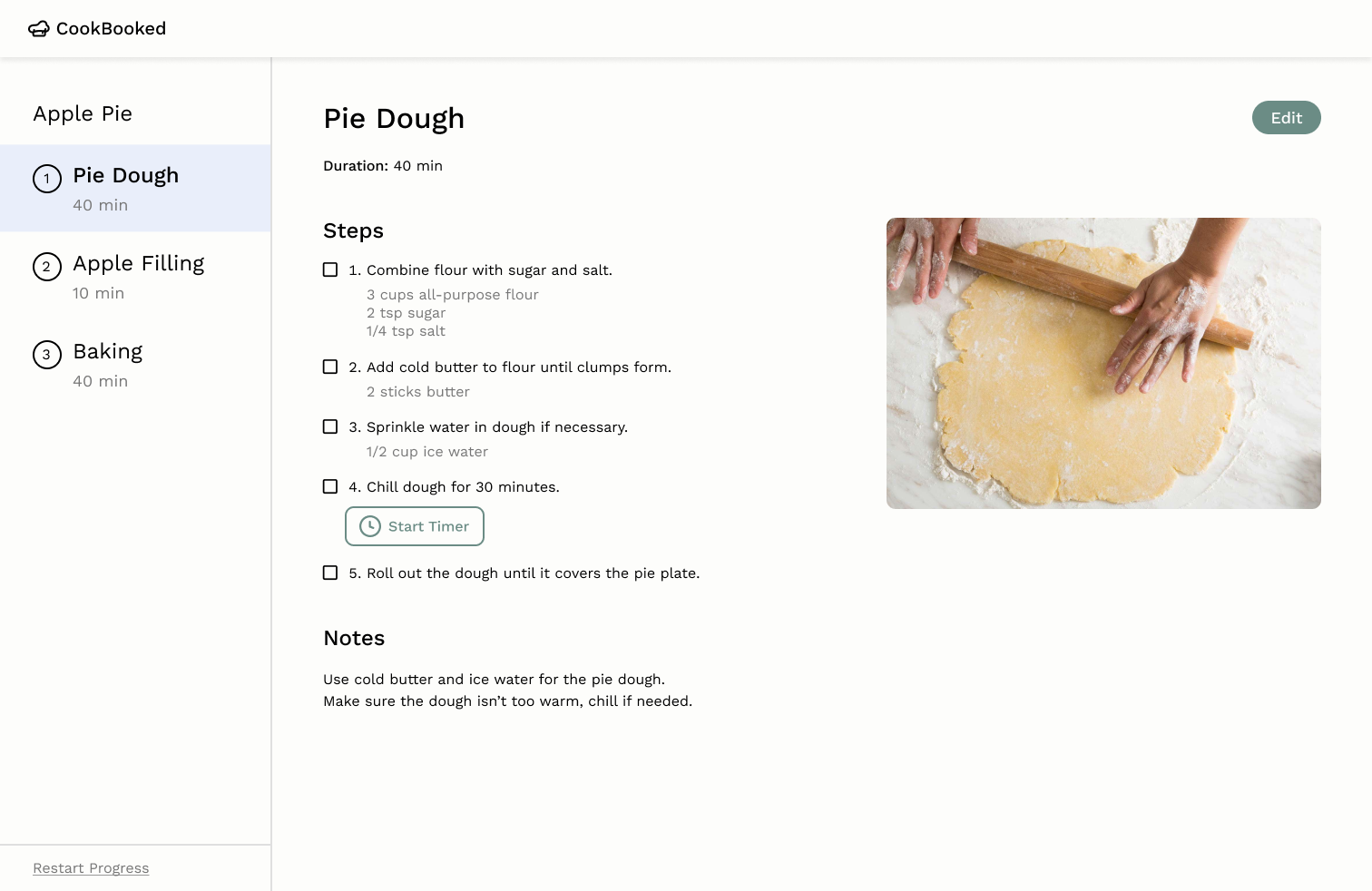
We received mixed feedback usability of the inline ingredient hovering, so we conducted A/B testing. By timing how long it took users to find a specified ingredient quantity for a step, we used a t-test to determine that users struggled less with variant 2. A Likert scale survey on perceived task difficulty also demonstrated that variant 2 was a more convenient, intuitive experience.
Variant 1: Keeping inline hovering
Maintains inline hovering & adds separate ingredients list for convenience
Variant 2: List under steps
Removes inline hovering & opts for a more direct approach


Final design & impact
For final feedback on CookBooked, users were very positive about the app's visual aesthetic and usability. Users appreciated the flexibility of the design and the thought given to a streamlined layout for following recipes.
Reflecting on our process
Balancing creativity & usability
While we wanted to introduce engaging interactions, we had to be careful with balancing innovative approaches with usability favoring simple designs
Expanding beyond the screen
With tech limitations in the initial project, we would have loved to explore how voice activated interactions could enhance the experience beyond traditional interactions.